Understanding and mastering the concepts of independent and dependent variables on a graph is critical for anyone studying data analysis, statistics, or scientific research. When we talk about these variables, we’re discussing the foundational components that drive the data points we see on graphs. This guide will break down these concepts into clear, actionable steps to help you confidently interpret and create graphs with these variables.
When learning about graphs, particularly scatter plots and line graphs, the independent and dependent variables are often the primary focus. The independent variable is what you manipulate or control in an experiment. The dependent variable is what you measure or observe. The relationship between these two variables is often depicted on a graph, allowing us to visualize how changes in one variable affect the other. However, many beginners struggle with understanding how to correctly identify, plot, and analyze these variables. This guide is designed to address those struggles with clear, practical examples and actionable advice to help you master these concepts.
Immediate Action: Understanding the Basics
To get started, let’s clarify the basics:
- Independent Variable: This is the variable that you change or control. It is often plotted on the x-axis of a graph.
- Dependent Variable: This is the variable that changes as a result of the changes in the independent variable. It is often plotted on the y-axis.
- Clear Visualization: Always ensure your graph clearly labels both the independent and dependent variables, and choose an appropriate scale for accurate representation.
Step-by-Step Guide to Plotting Independent and Dependent Variables
Let’s dive into a detailed step-by-step process to plot these variables accurately:
Step 1: Identifying the Variables
To begin, you need to determine which variable is your independent variable and which is your dependent variable. A practical way to identify them is to think about the cause and effect relationship in your experiment or study.
- Consider the context: Are you looking at how a change in one factor leads to a change in another?
- Think logically: Which variable do you control or manipulate?
- Check your study design: Often, experimental designs clearly outline these variables.
Step 2: Collecting Data
Once you’ve identified your variables, it’s time to collect data. Make sure you gather enough data points to draw meaningful conclusions.
- Experimentation: Conduct trials where you can measure the effects of changes in the independent variable on the dependent variable.
- Consistency: Maintain consistency in measurement units and conditions for accurate results.
- Documentation: Record all observations meticulously for later analysis.
Step 3: Organizing Your Data
After data collection, organize it in a table format to streamline the graphing process.
For example:
| Independent Variable (X) | Dependent Variable (Y) |
|---|---|
| 1 | 5 |
| 2 | 8 |
| 3 | 10 |
| 4 | 14 |
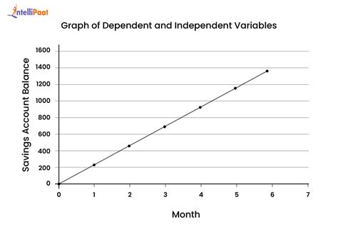
Step 4: Creating the Graph
Now that your data is organized, plotting it on a graph is straightforward:
- Draw axes: Label the horizontal axis with your independent variable and the vertical axis with your dependent variable.
- Plot points: For each pair of (X, Y) values, plot a point on the graph.
- Draw a line: If the relationship appears linear, draw a line of best fit through the points.
Tips and Best Practices
Here are some tips to ensure you’re graphing correctly and accurately:
- Consistency: Use consistent scales on both axes for an accurate visual representation.
- Clarity: Label axes and points clearly to avoid confusion.
- Sampling: Collect a sufficiently large sample size to ensure statistical significance.
Common Mistakes to Avoid
Avoiding common mistakes can prevent misinterpretation of your data:
- Mixing up variables: Ensure you’ve correctly identified the independent and dependent variables.
- Scale errors: Choose appropriate scales to ensure accurate representation.
- Ignoring outliers: Analyze outliers and consider their effect on your data.
Practical FAQ
What if my data doesn’t form a straight line?
If your data points do not form a straight line, it might indicate a non-linear relationship. In such cases, consider fitting a curve or exploring polynomial relationships. This can often reveal more complex relationships between your variables. Always ensure your best-fit line or curve accurately represents the trend in your data.
How do I determine the best-fit line?
To determine the best-fit line, you might use the least squares method which minimizes the sum of the squares of the vertical distances from each data point to the line. Tools like Excel or statistical software often have built-in functions to perform this calculation. Alternatively, you can use graph paper and draw the line that best represents the trend in your data points, ensuring it has roughly equal numbers of points above and below it.
How do I interpret a graph with multiple variables?
When you have multiple variables, you might be working with multivariate graphs such as scatter plots with different colored points or lines representing different groups. Always label each axis and each group clearly. If you’re looking at the relationship between two primary variables, focus on the primary trend first and then consider how other variables might influence this trend. For more complex analysis, statistical software or multivariate regression models might be required.
By following these steps, tips, and avoiding common mistakes, you’ll be well-equipped to master the identification, plotting, and analysis of independent and dependent variables on a graph. Remember that practice makes perfect. Don’t hesitate to use real-world examples to cement your understanding and explore different datasets to see how these concepts apply in various contexts.
This guide should provide you with the practical knowledge and confidence to handle independent and dependent variables on a graph with ease. Whether you’re working on a scientific project, an academic assignment, or just curious about how to interpret data visually, you now have a comprehensive roadmap to follow.