Understanding frequency in statistics is essential for any data-driven analysis. Whether you’re a seasoned analyst or a newcomer to the field, knowing how to find frequency swiftly and accurately is a critical skill. This guide delves into practical methods and expert tips on mastering this fundamental statistical concept.
Key Insights
- The frequency distribution enables quick analysis and insights from data.
- Utilizing histograms can visually represent frequency data effectively.
- Implementing statistical software or programming languages like Python can expedite frequency calculations.
In statistics, frequency refers to the number of times a specific value appears in a dataset. This information is crucial for understanding the data’s distribution and central tendencies. To master finding frequency, begin by organizing your data. Grouping similar values together, or binning, is essential. A frequency table is a common tool where each unique value and its corresponding frequency are listed.
For a practical example, consider a dataset of exam scores for a class. By sorting the scores in ascending order and counting the occurrences of each score, you create a frequency distribution table. This table not only highlights the most common scores but also identifies outliers and the spread of the data.
Understanding Frequency Distributions
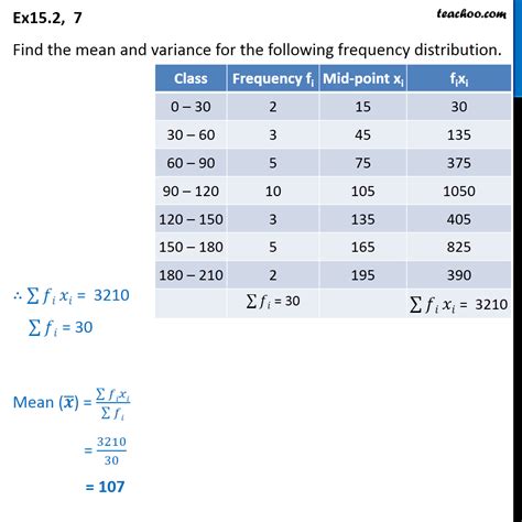
A frequency distribution organizes data into classes or intervals to summarize the frequency of values that fall within each range. This method simplifies large datasets and makes it easier to interpret trends. To create a frequency distribution, start by deciding on the number of bins. A commonly used rule of thumb is the square root rule, where the number of bins equals the square root of the number of observations.Using the exam scores example, if there are 100 students, you would create ten bins. Each bin covers a range of scores, and within each, you count the frequency. This approach quickly highlights which score ranges are most common, allowing for more in-depth analysis like calculating the mean, median, and mode of the dataset.
Visual Representations: Histograms and Bar Charts
Beyond tables, visual representations like histograms and bar charts provide clear, immediate insights into the frequency of data values. Histograms are particularly useful as they plot the frequency of values on the y-axis against the value or range of values on the x-axis. The result is a visual distribution that can be easily interpreted to gauge where most data points lie.For instance, if the exam scores were plotted in a histogram, it might reveal a bell curve, indicating a normal distribution. This visualization would be more intuitive than raw data alone. Moreover, bar charts can compare frequency across different categories within the data, useful in multi-variate studies.
Can I use software to quickly find frequency?
Yes, utilizing software like Excel, R, or Python can automate and expedite the frequency calculation process. For instance, Python’s Pandas library offers efficient ways to tabulate and visualize frequencies.
How do I choose the right number of bins for a histogram?
Choosing the right number of bins is crucial. The square root rule is a good starting point, but consider the dataset’s size and range. Experiment with different bin sizes to find a balance between too few bins that oversimplify and too many that clutter.
Mastering how to find frequency in statistics involves understanding and applying frequency distributions and utilizing visual aids like histograms and bar charts. By leveraging these tools, you can quickly and accurately interpret data distributions, providing valuable insights for analysis. Embracing software and programming languages can further streamline these tasks, making data interpretation more efficient. With these techniques, you’ll be well-equipped to handle statistical data with confidence and precision.